Blue Monday Coffee
Brand Identity / Packaging / Digital
Blue Monday is a coffee that helps you recover after drinking or dehydrating activities. The identity concept targets an audience with a social lifestyle that appreciates quality products with a hip and aesthetic brand design.
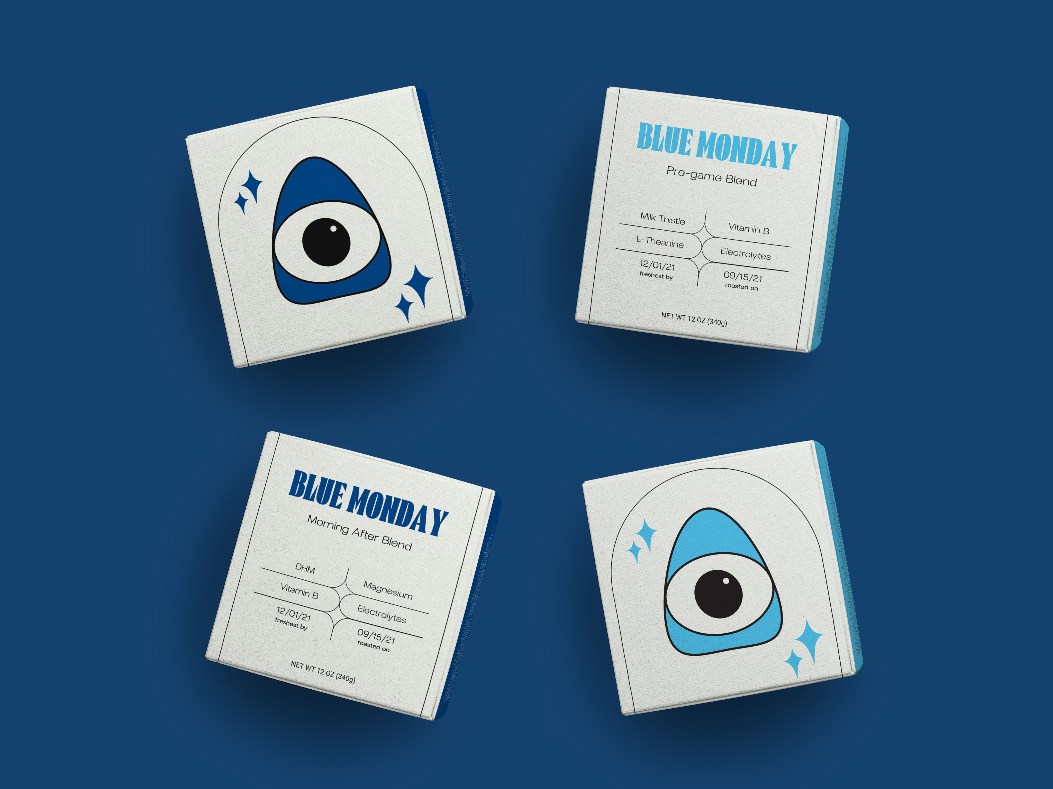


The Big Idea: The brief for this project was to create a product concept for a coffee company and then design the company brand identity, logo, and packaging for the product. In my ideation phase I reflected on what could set a coffee apart, and drawing off of my own experience, I thought about how I wished that coffee didn’t make me feel dehydrated and anxious. This would be particularly helpful when recovering from drinks or even just at a time that you’re struggling to take the best care of yourself. From there the idea for Blue Monday was born; A coffee that rehydrates instead of dehydrates and has added vitamins and supplements for overall wellbeing.
Name Inspiration: With a target audience of socially active young adults, I drew off the phenomena of The Monday Blues. After a big weekend of going out with friends and riding the high of a break from work, there can be this crash on Monday as you start the week all over again. This product’s mission is to be a coffee that helps you avoid that Blue Monday.
Blue Monday is more than just a coffee and aims to help your mind and body. This mission lead me to explore an aesthetic that felt spiritual and medicinal. I wanted the branding and packaging to be reminiscent of natural medicine with a majestic feeling. Leaning into the name when it came to color palette was an easy choice; The deep royal blue feels calming, yet luxurious. For graphic elements and logo I knew I wanted something that appeared heavenly and organic and the rounded, pyramid shaped eye evoked that sense.
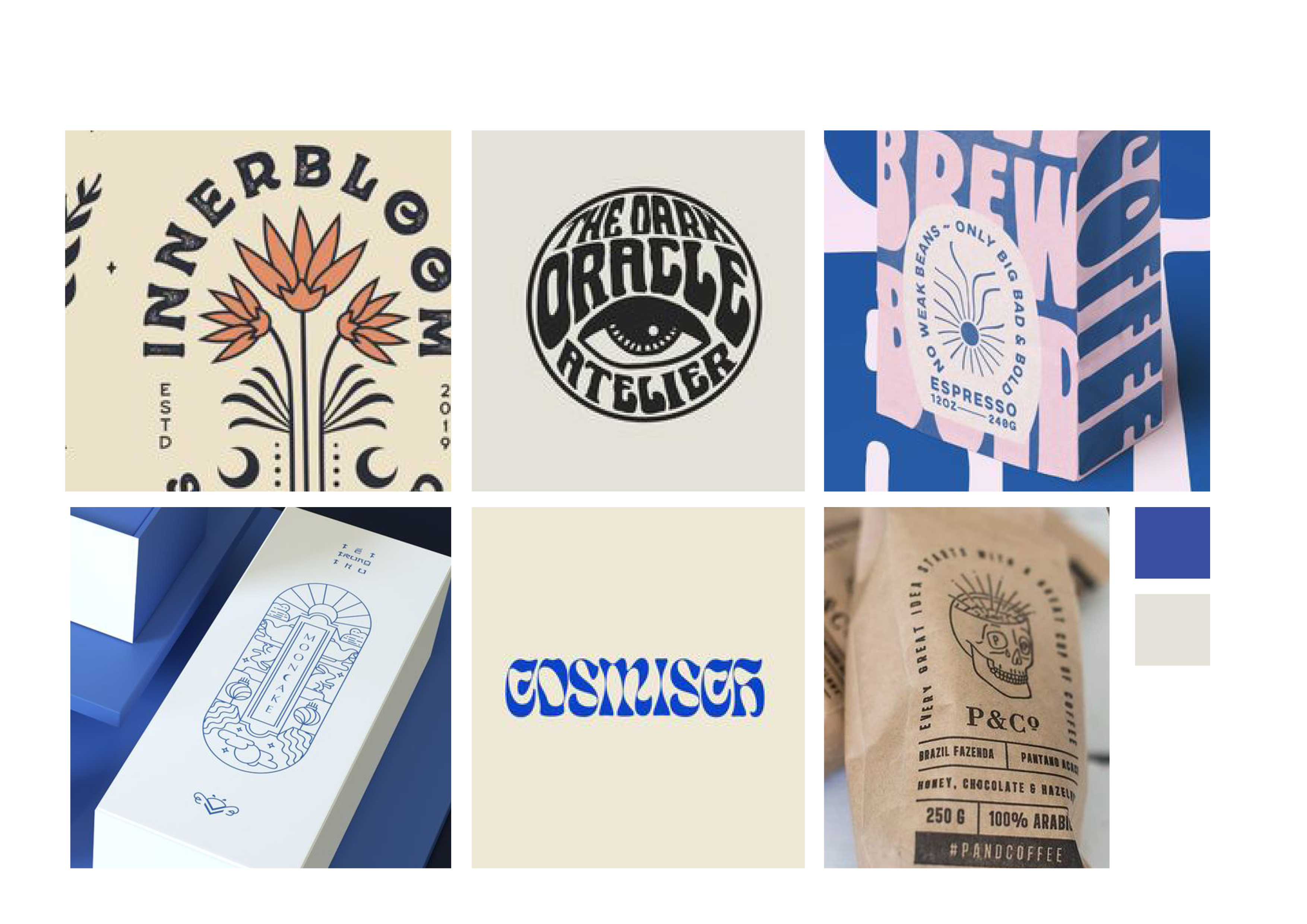
Original Moodboard - Overall brand look and feel
Name Inspiration: With a target audience of socially active young adults, I drew off the phenomena of The Monday Blues. After a big weekend of going out with friends and riding the high of a break from work, there can be this crash on Monday as you start the week all over again. This product’s mission is to be a coffee that helps you avoid that Blue Monday.
Blue Monday is more than just a coffee and aims to help your mind and body. This mission lead me to explore an aesthetic that felt spiritual and medicinal. I wanted the branding and packaging to be reminiscent of natural medicine with a majestic feeling. Leaning into the name when it came to color palette was an easy choice; The deep royal blue feels calming, yet luxurious. For graphic elements and logo I knew I wanted something that appeared heavenly and organic and the rounded, pyramid shaped eye evoked that sense.
Original Moodboard - Overall brand look and feel